Establishing a strong visual style for Kraken has been a priority from day one. Until recently, though, the distinctive 50s aesthetic – with its carefully curated colour palette and comic-book visual references – has been largely confined to the gameworld, the spaces inhabited by the player and characters. As we’re approaching (say it quietly) the final stages of development, we wanted to extend that visual style to the user interface (UI) as well: to the menus, buttons and controls, in order to immerse the player from the moment they launch the game. Here’s how we went about it:
Brief, inspiration, and initial concepts
My brief was to re-work and develop the placeholder UI for The Kraken Wakes to be both more visually striking and more in-keeping with the game’s 1950s style and themes. This would involve creating a wide range of UI elements including checkboxes, tabs, next/previous controls, input fields, dropdowns, persistent hotkey instructions, content alerts and menu items.
As part of the UI overhaul, we also spent a lot of time thinking about the usability and clarity of the interface – UX as well as UI. This led to the addition of some new features, including a ‘Chapters’ menu page to enable players to track their progress and navigate back to earlier scenes. It wasn’t just a case of creating like-for-like UI elements with a bit more pizzazz: whole new features needed to be developed from scratch.
My process began, as it usually does, with a search for design inspirations. I decided to explore visual styles connected to different themes and aspects of the game, including journalism, under the sea, 1950s adverts and comics, and retro art. I also spent some time researching the UI designs of other games, such as Firewatch, Sea of Thieves and L.A. Noire. As per the brief, my guiding inspiration was the already-established art style of the game (having worked on the props and environments previously, I was already very familiar with this). Below is a small moodboard showing some of the inspirations I referred to while redesigning the UI:
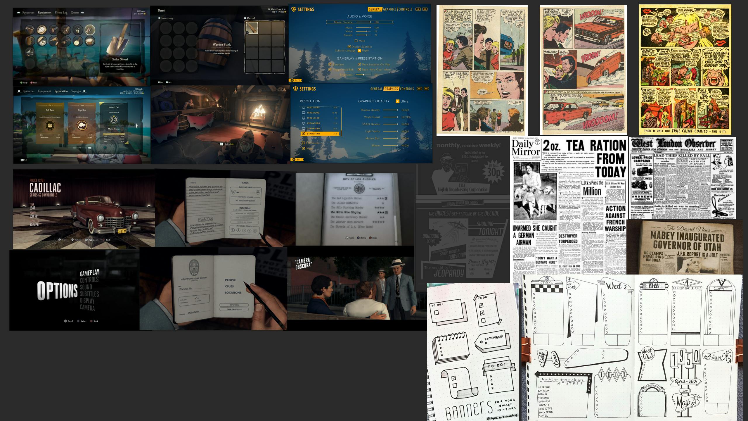
A moodboard of initial inspirations for the new Kraken UI.
After my initial research, I began drafting some ideas. I sketched some concepts for UI elements in various styles using Adobe Photoshop and Illustrator. I also explored different fonts and colours at this stage.
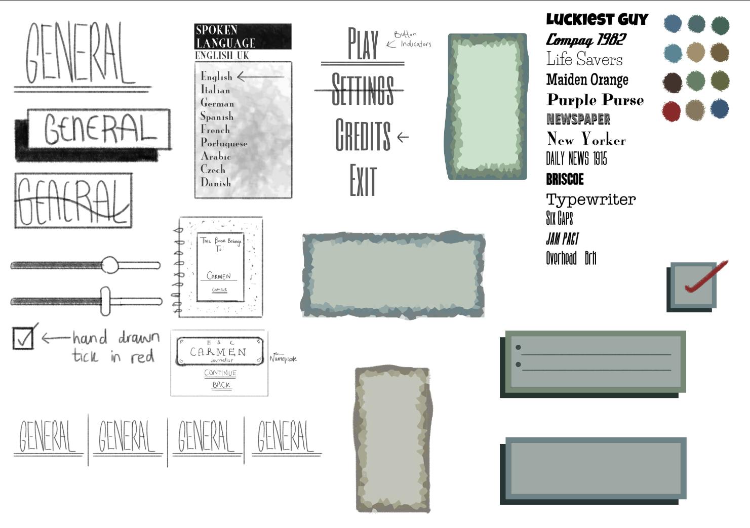
My quick, early concepts for the new UI designs.
The team and I consulted back and forth to determine which style worked best for the game. In the end, we agreed that we liked the offset retro block designs, with hand-drawn ticks, crosses, arrows and underlines where the player would interact with certain aspects of the UI. This aesthetic allowed us to reflect the retro, 1950s setting of the game in the UI design, while also referencing the theme of journalism through the hand-drawn elements.
Developed concepts for buttons and menus.
Developing the style
Once we had agreed on a style, I then developed the designs further using Adobe XD. I created examples of what the UI might look like in the game itself by taking screenshots and placing my UI designs and layout over them. This also helped me to develop the colour palette, ensuring it worked with the colours of the game. Here’s my final design for the main gameplay UI:
A mock-up of the main gameplay UI using a screenshot from the game.
I regularly updated the team on my progress and, after a few rounds of feedback, I achieved the desired look and feel of the various UI elements of the game. Below are two series of screenshots charting the design development process for the menu and settings pages. On the left are my initial ideas, and on the right are my finished designs.

The design development of the main menu and settings screens.
Finalising the UI
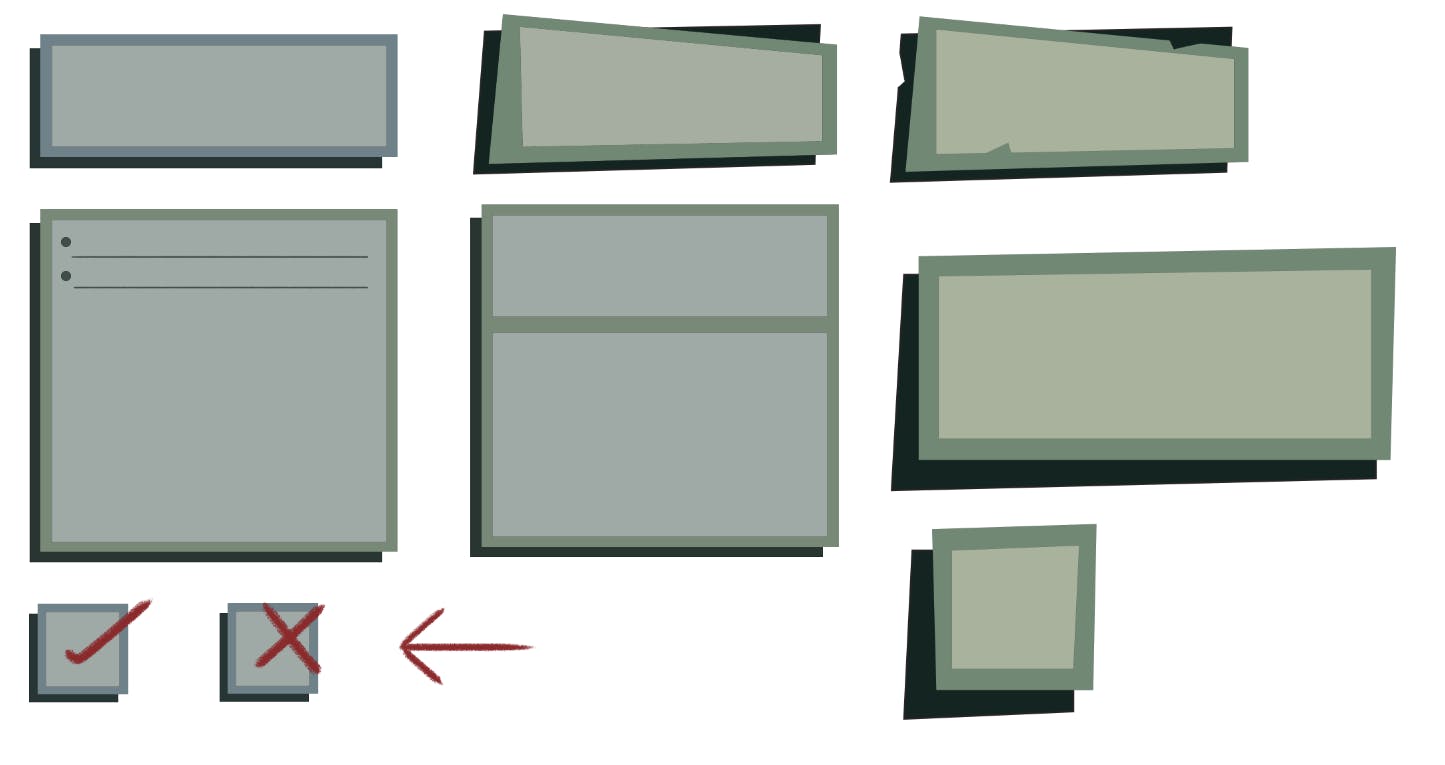
Once the team had approved the final designs, the next step was to separate the UI elements onto individual islands, and to organise the colour palette to be clearly presented for the person arranging the UI in Unreal. Doing this also makes the different elements easier to organise when exporting.
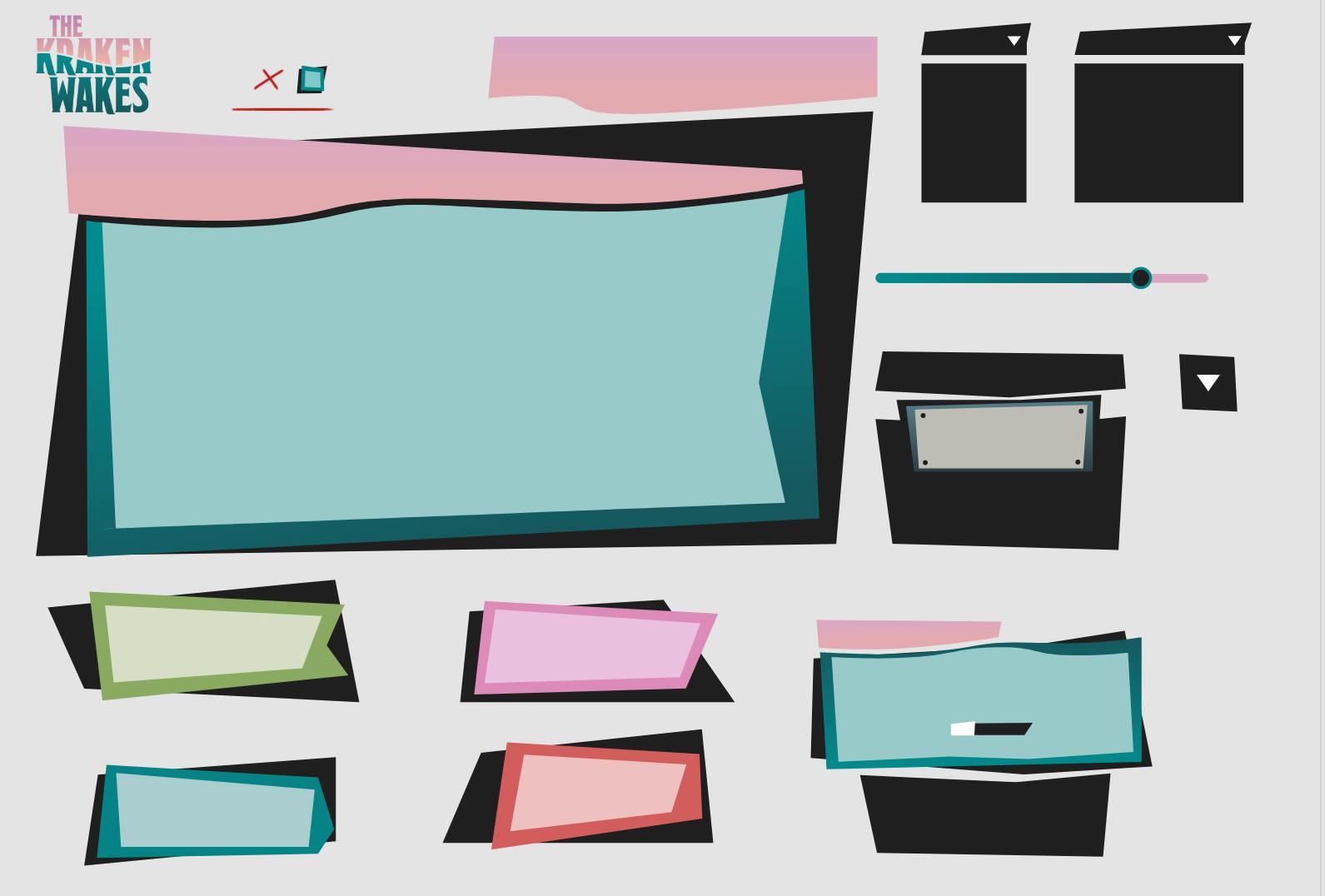
Menus and buttons separated onto individual islands.
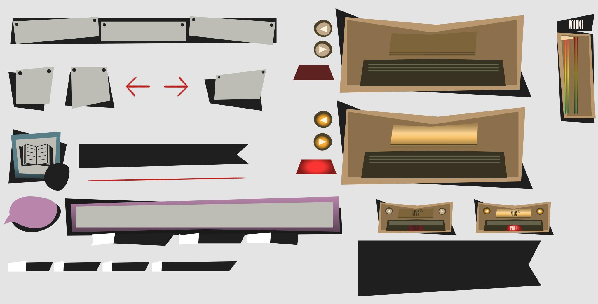
More menus and buttons separated onto islands including the design for the radio controls.

The menus and buttons for the 'Chapters' page separated onto islands.
The UI elements had to be exported in a particular way. Each element had to be split up into its different shape components, coloured in white (or black-to-white gradient for UI elements with gradient colours), and then exported separately. This step is required because the UI colours are assigned in Unreal. If the UI components are merged into one object, they cannot be assigned separate colours:

An example of breaking a button down into its component shapes.
Once everything had been exported, it was up to our programmer, Oscar, to create the functionality of each UI element and make it work in the game!
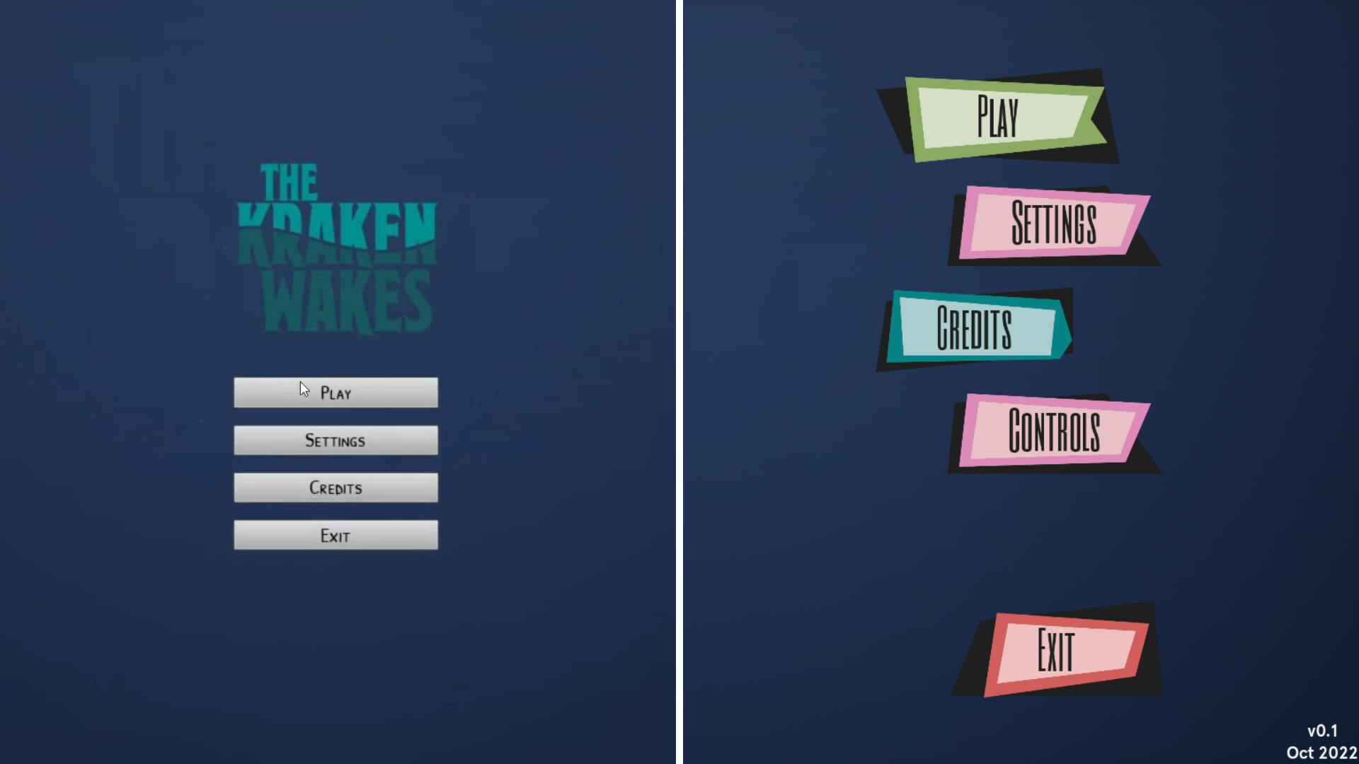
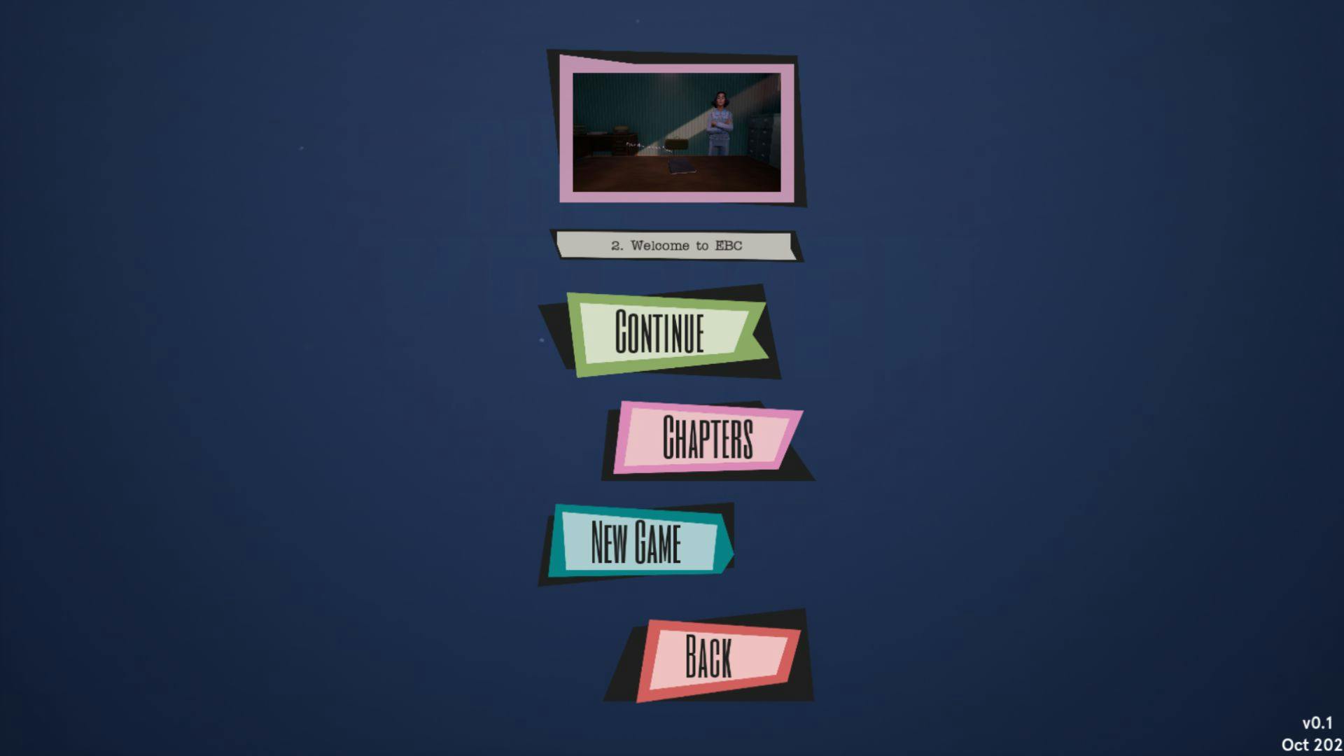
Before and after: the main menu.
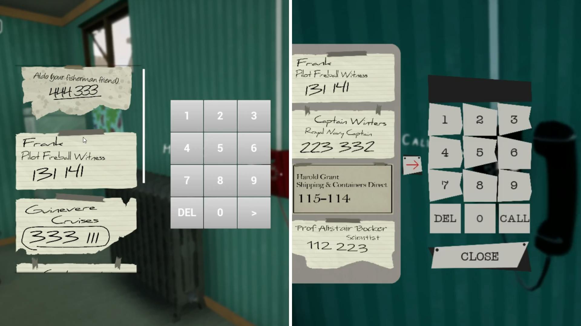
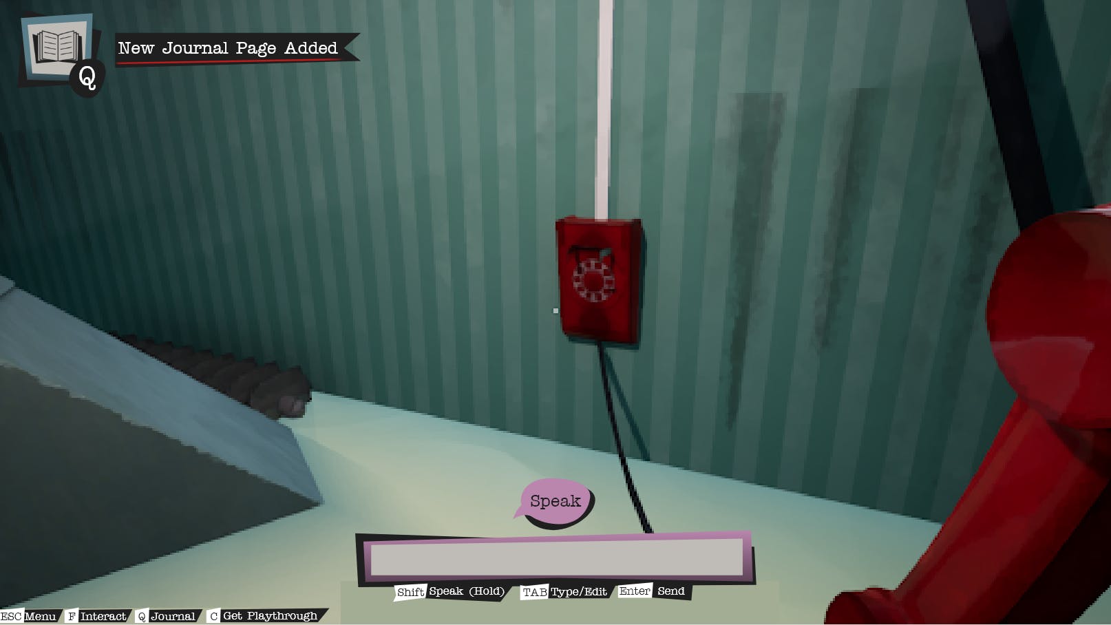
Before and after: the phone interface.

Before and after: the settings menu.