How do you go about turning 2D, black-and-white words on a page into a vivid and immersive 3D game world?
Today, game design is an art form. Games of the past might have been held back by low poly counts (we’ve all seen PS1 Hagrid), but improvements in computer graphics mean it’s no longer just about clarity: it’s also about style.
From the beginning, we knew we wanted to remain loyal in our aesthetic to the 1950s setting of John Wyndham’s original. The whole team – including our lead writer Rianna, our 3D artist Carmen, and our character designer Emily – contributed at this stage, finding reference material from which we could develop our visual style. This included historic content from the 50s, like comic strips and adverts, as well as game visuals, film posters, photographs and artworks. We pooled and organised these references in a mood board:
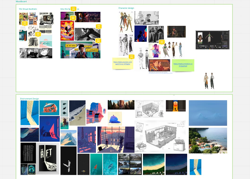
A screenshot showing location and character design inspirations for Kraken.
The next stage was to start trialling different looks by building models with varying degrees of realism and testing different texture methods. Very early in the process, we spent a bit of time trying out a heavily monochromatic or black-and-white visual style. This is something we’d seen done brilliantly in a number of our favourite games, and it featured a lot on our mood board. However, we moved away from this idea quite quickly, as we wanted to be able to use colour to show progression in our environments and changes in the mood of the game.
Once we’d decided on our 3D style, colour palette, texturing method and so on, we spent some time trialling different post-processing effects, to work out how we could leverage Unreal Engine’s rendering features to help us achieve a distinct look for the project. Here’s an early example of the same prop (a non-game prop) with three different post-processing effects applied:
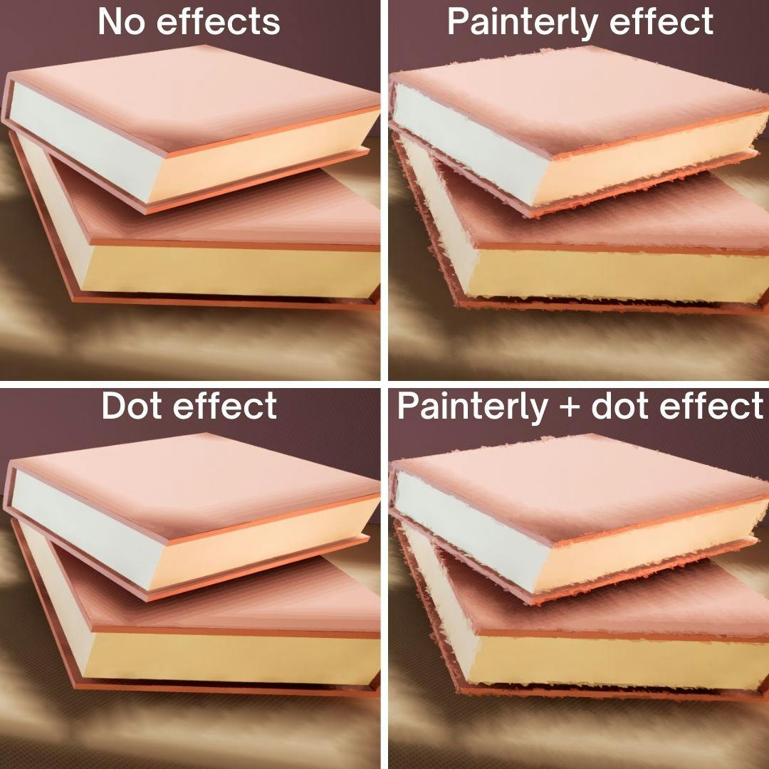
An example of our post-processing experiments.
After some experimenting, we settled on a post-processing method that would push the painterly look of the props and environments further.
It was so important to spend this time trying out different aesthetics and agreeing on a style as a team. Having these key decisions in place from the outset sped up the technical side of creation, as everyone had a clear understanding of the vision for the game. The action of The Kraken Wakes takes us to a wide range of locations: we have scenes in a London office, scenes aboard fishing boats and military ships, English coastal scenes and tropical beach scenes. Establishing a clear and distinctive visual style has allowed us to create a dynamic and diverse set of environments which still all feel like they’re set in the same world.
We’ll be diving into the prop and environment building processes in more detail in future weeks, so I’ll just give a quick overview of the workflow here:
For any environment – that is, a setting in the game like the EBC journalists’ office – we’re juggling the narrative purpose, the gameplay requirements, and the desired aesthetic. So, first things first, the writers, level designers and prop artists meet to discuss the key elements that need to be accounted for. Then, an asset list is created, along with a floor plan or level design laying out how the environment will all fit together. That gets signed off by the writer or designer in charge of the scene, and then the level gets blocked out and the environment assets and props are built. In some cases, there are multiple levels set within the same environment: for instance, we see the EBC office flooded, with one desk, and with three. Different props and textures are needed for these different levels, but they all use the same environment.
Here’s an example of blocking out a level (Mike and Phyllis’s cottage) – creating a basic 3D layout to give a sense of the space, without any of the game-specific props or textures:
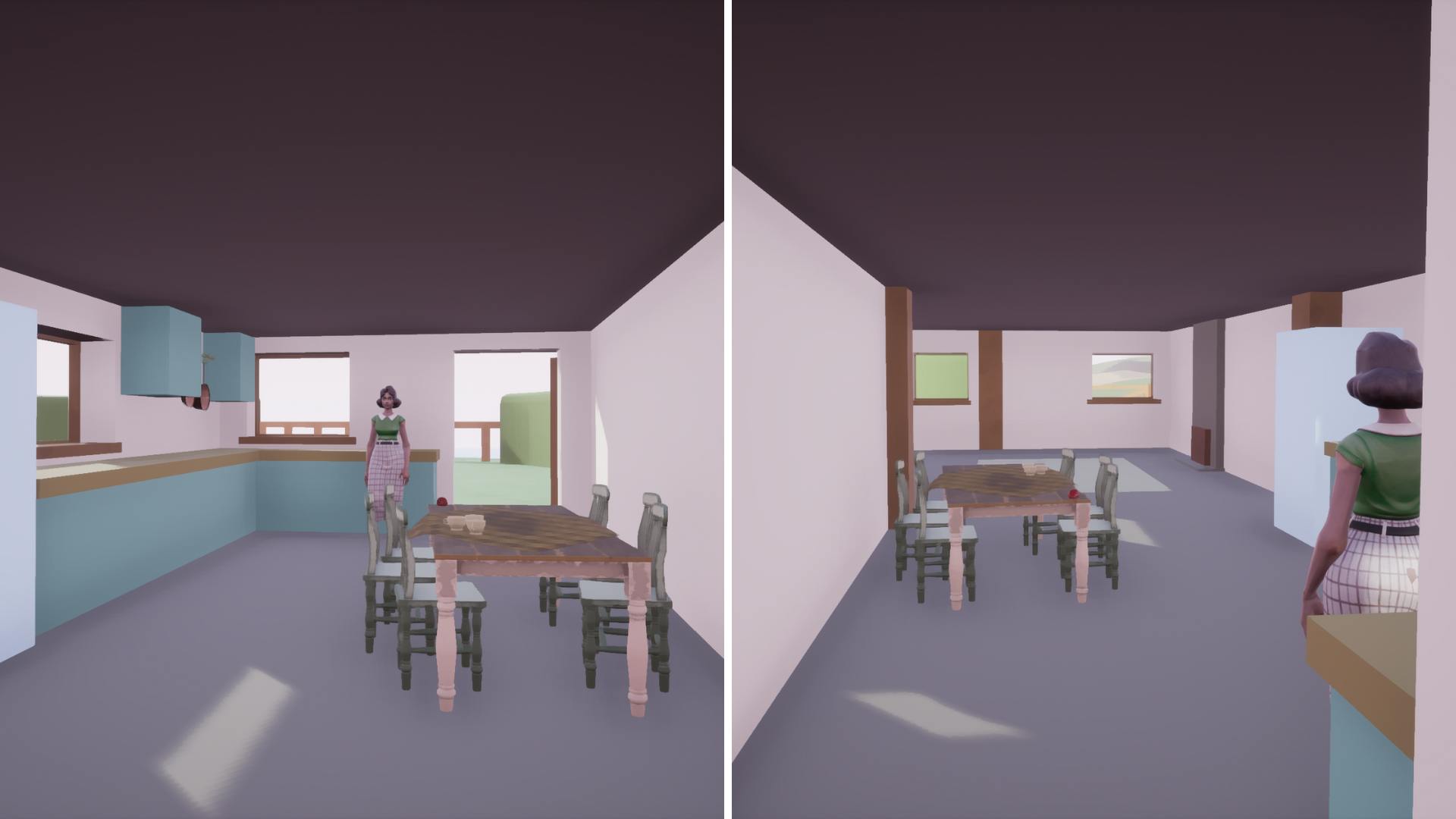
"Blocking out" establishes layout rather than visual design.
Once the assets are made, the level designer and prop builder work together to populate the environment with assets and static props. Gameplay designers then add any interactive elements to the environment, normally using some of the props built by the prop artists. When everything is ready for narrative integration, the level is packaged and sent to the writer for scene-direction: adding in characters, linking up the script, and choreographing the game play.
And that’s how it all comes to life!
I know that was a whistle-stop tour of the game design and development process – so stay tuned for future instalments discussing different aspects of this in more detail, including, next up, a post exploring the steps involved in creating characters for Kraken.
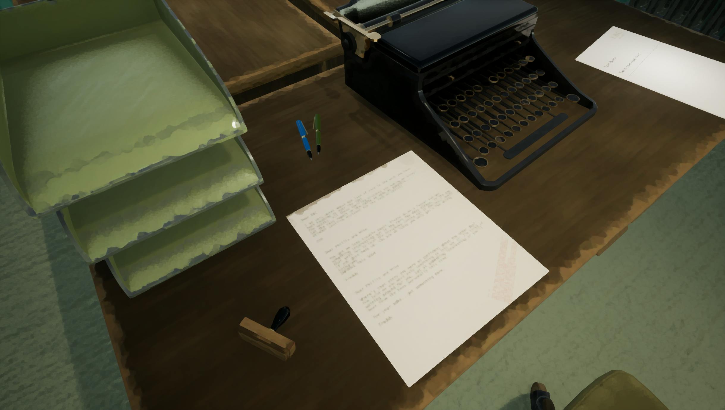
The finished product: a desk in the EBC news office, demonstrating the visual design of The Kraken Wakes.